The 5: Television Production Logos
at
This Week on The 5: Creative Television Production Logos
This week, we celebrate the shortest creative films around– the production logo. Who doesn’t love 6-10 second bits of moving picture and sound seen at the end of TV shows? One of the truly unsung heros of the creative world– these little gems quietly evolved as a unique way to brand a production company. They’re short. They’re sweet. And they’re a personal signature for the production company to leave behind. Scroll down to the bottom to see photos and videos of these tiny little production pieces.
- Bad Hat Harry Productions. Bryan Singer, feature film writer/director producer whose credits include The Usual Suspects and X-Men produces the TV show House. His logo is his nod to Spielberg and his 1975 film Jaws. It’s great when one movie guys thinks so much of another movie guy that he takes a simple moment from the movie and turns that into the symbol that represents his entire company.
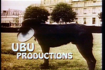
- Sit UBU Sit. Probably one of the most well known pieces belongs to Gary David Goldberg’s company which produced Family Ties and Spin City. The logo features his voice, and his own dog, Ubu Roj. He took the name from an 1896 play. Sad note, the dog died in 1984. Happy note, Goldberg went on to direct, write and produce”Must Love Dogs” in 2005.
- MTM Productions. The company was founded in 1969 by Mary Tyler Moore and then husband Grant Tinker. The logo is a spoof of the MGM lion, and the cat’s name was Minsie. The damn cat would not say cookie, and would not meow on command, so they got footage of a yawn and ran it in reverse and dubbed in the meow. MTM produced over 30 shows, and the often modified the logo by dressing up the cat to match the show. For Remington Steele, they gave the cat a Sherlock Holmes cap and pipe.
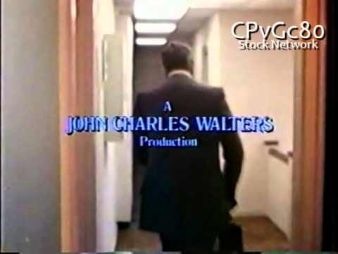
- John Charles Walters Productions. The company that produced Taxi was founded by 4 guys from MTM – James L Brooks, David Davis, Stan Daniels and Ed Weinberger. They took the name from a Pub. Weinberger said they “wanted a venerable Protestant name”. The guy in the logo is Weinberger, and it’s his assistant that says goodnight. The character looks just like you’d imagine a writer-producer of a big show would be like at the end of the day– totally spent after working a 14 hour day. He makes magic, and we in the audience are all amazed, and his response is to rub his head and utter “ahhhh”.
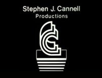
- Cannel Productions. Founded by recently passed Stephen J Cannel, who created or co-created over 40 shows including The Rockford Files, The A-Team and Mike Hammer. His logo is himself, which makes it as personal as you can get. The rush of typing the last line of something great and ripping it out of the typewriter is just perfect. This logo evolved over the years, changing clothes, adding an Emmy in the background and even aging. It says, quite perfectly, this is me and I wrote this thing.

Let us know which ones are your favorites. We know we had to leave out a lot of great ones.
* * *
***
***
***
***